
European Carousel
Eurpoean Carousel
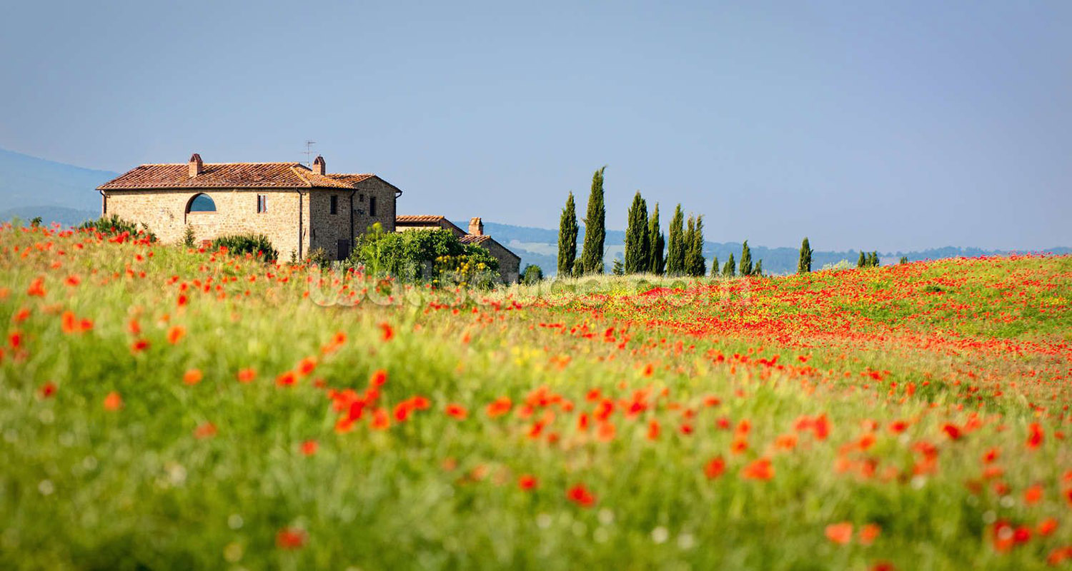
Georgeous views above compare...
Click through the Bootstrap carousel to see the glories of Europe.
Once I travel the sites, I'll have even more images to share.
Georgeous views above compare...
Click through the Bootstrap carousel to see the glories of Europe.
Once I travel the sites, I'll have even more images to share.

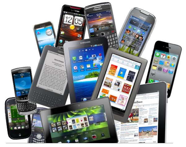
Learn some responsive Web Design tips!
Open the Responsive Tips Web site with a laptop, tablet, and mobile view so you can see the differences created in the CSS coding using media queries.
In addition to media queries, make sure to use percents for image sizing and HTML5 elements, such as article and section tags, to define the columns.